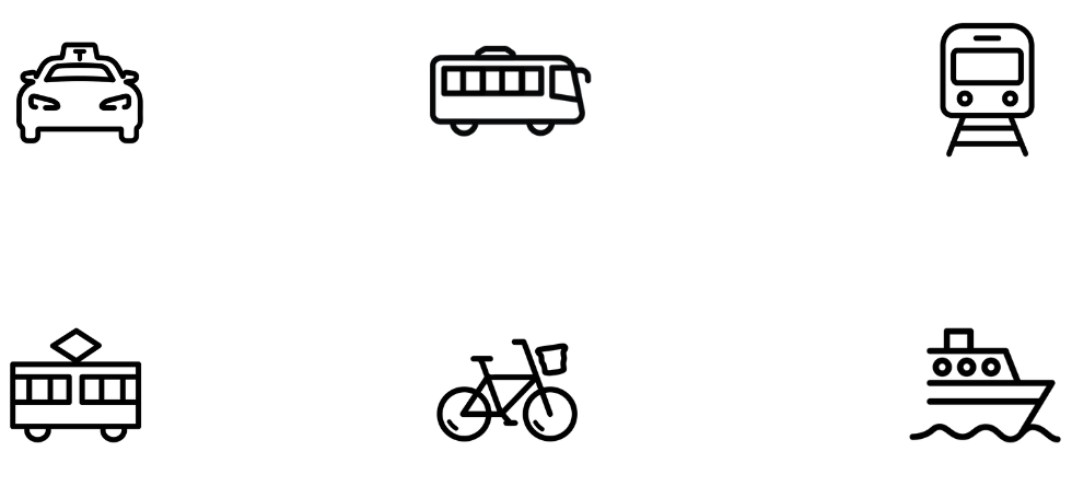
ICON SET DESIGN
JUNE 2024
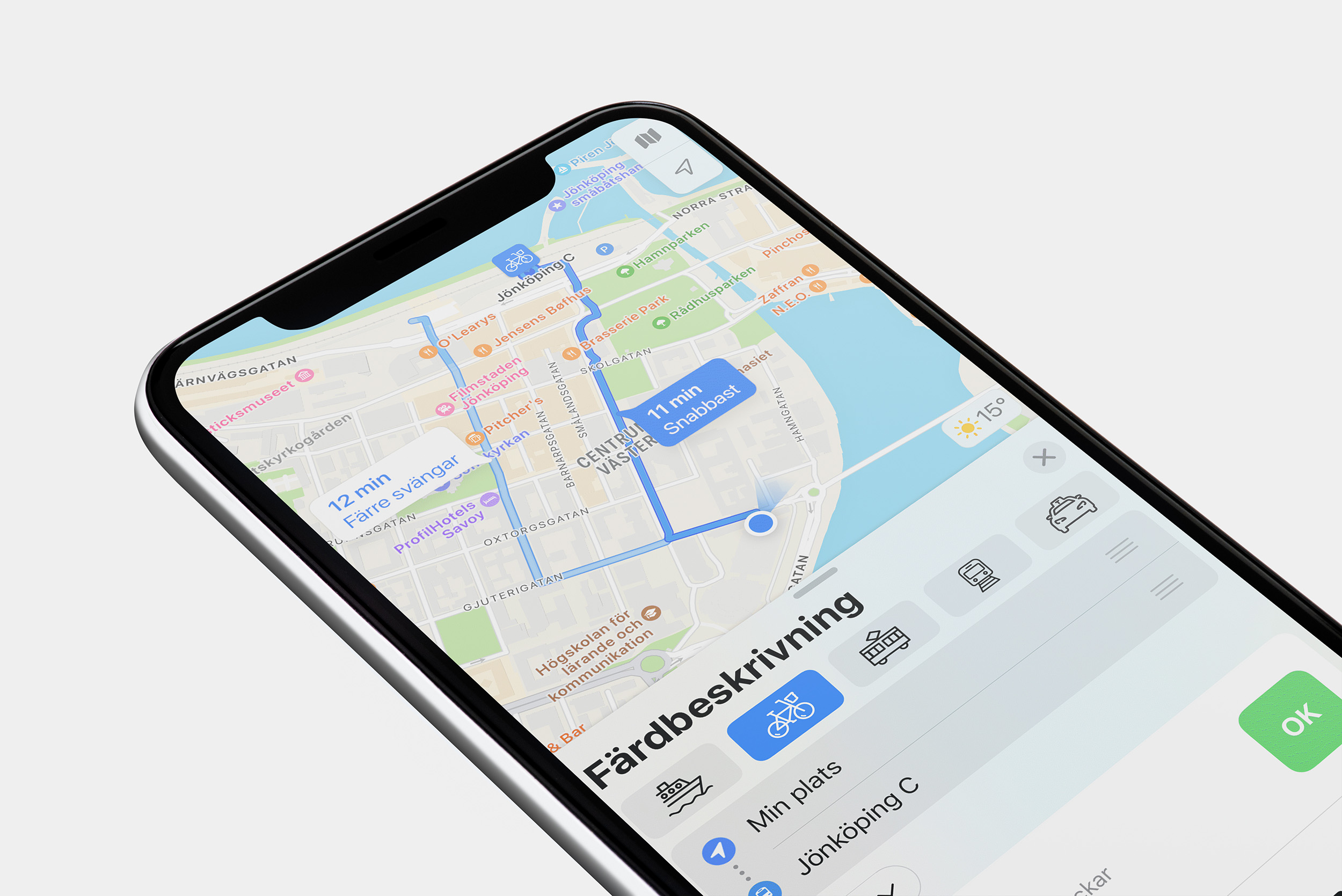
The purpose of my design was to develop a set of intuitive icons
tailored for newcomers navigating a busy urban environment. Imagine
you've just arrived in a big city for the first time, eager to
explore. However, navigating can be a bit daunting without prior
knowledge of the city's transportation options. This is where the
icons come in. Designed to be instantly recognisable and informative,
they provide newcomers with a visual guide to the various
transportation modes available.
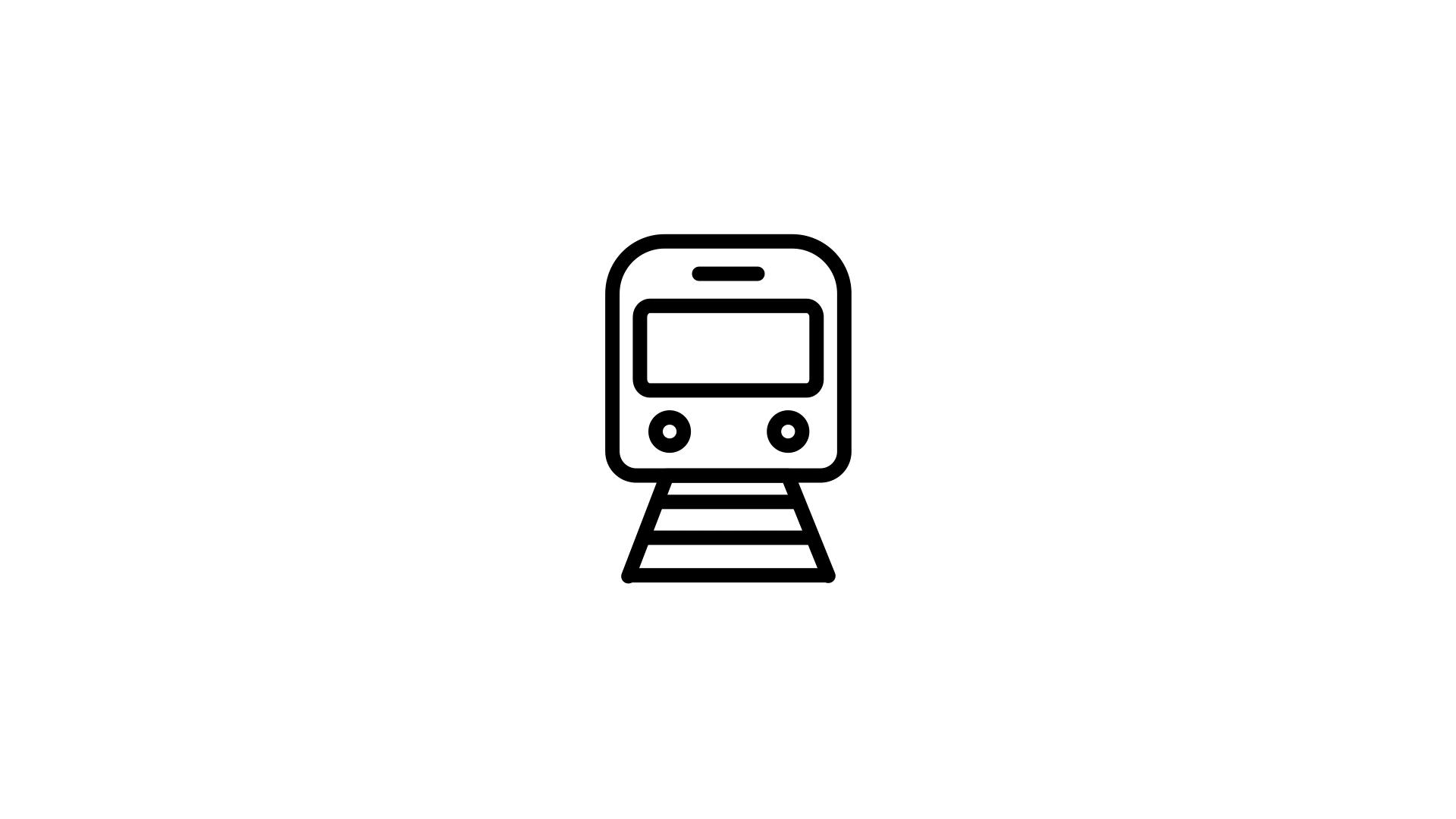
For instance, if you're looking to travel longer distances quickly,
the train icon directs you to the city's train network, offering
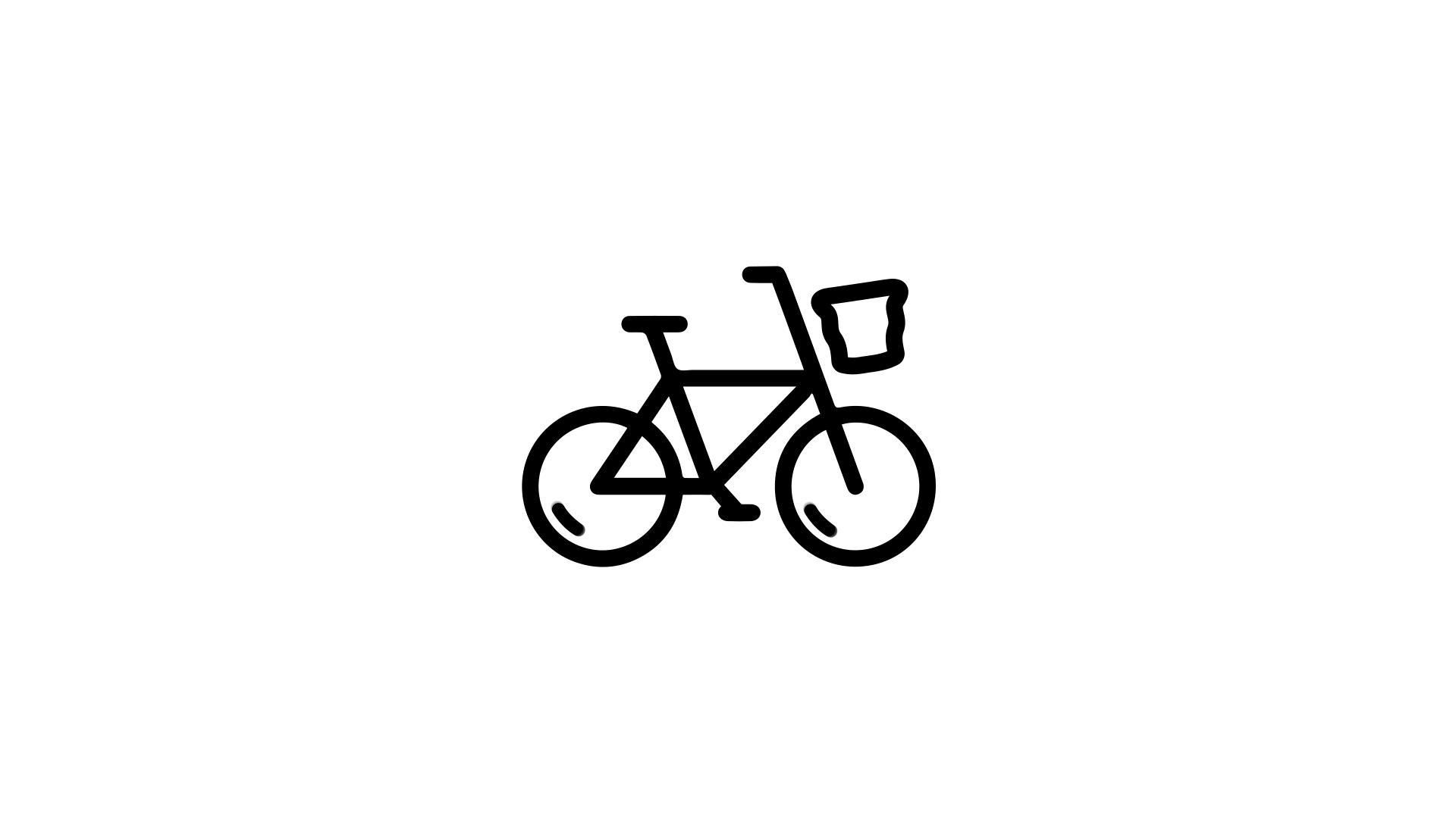
efficient transportation options. If you prefer a more eco-friendly
mode of travel, the bicycle icon indicates designated bike lanes,
perfect for exploring the city at your own pace.
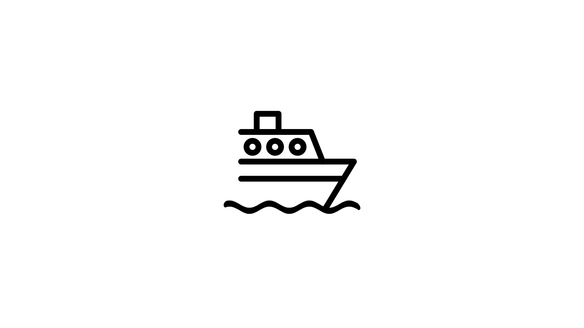
Each icon not only signifies the mode of transportation but also
conveys essential information such as estimated price, travel time,
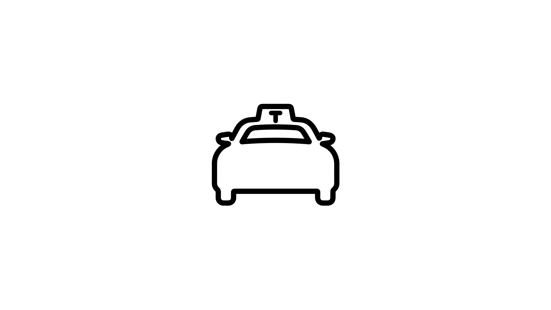
and distance. Whether it's catching a bus or hailing a taxi, these
icons empower newcomers to make informed decisions based on their
preferences and needs.
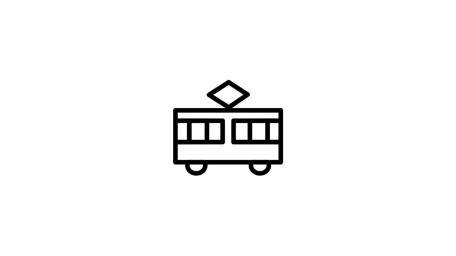
I wanted to create simple and clean icons with rounded corners to make
them "kinder". My idea was to only make outlines of the icons and
never fill anything in to maintain the same aesthetics. I decided I
wanted my icons to be in black and white as it will easily fit into
the app (hopefully) one could create some day. Also if one would like,
the black could easily be changed to other colours to fit whatever
theme an app or website would have.